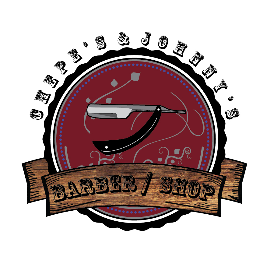
Chepe's & Johnny's - Barber / Shop

My cousin in Jalisco, Mexico, told me he wanted an identity for his new barber shop. He gave me some pictures of what he wanted. he said " I want something oldie and vintage."
I did some research on those two words and both of them were definitions of something old that still fit into this modern era. I thought the the wood would give it that permanence into this time and the typeface projects that feeling of a past time but still lives in this life. The colors are not the usual red and blur colors of a barber shop. They are more of a wine red and a purpleish blue which are the two branding colors. The black is a complementary color. The blade and the lines behind symbolize the fine work and quality of their brand.
