

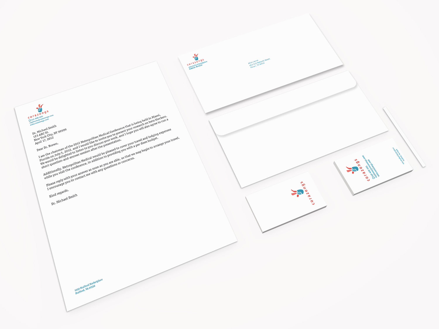
The stationery design was really fun. I wanted to give a clean and fresh look to the company. The logo really projects a hieroglyph of an ancient culture.
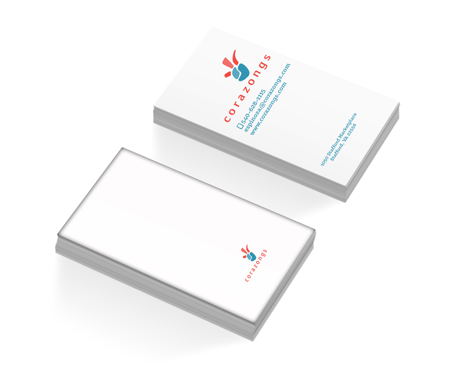
The obejective of the entire class of corporate and branding was to develop and design the image and brand of an unexisting company. I took on using my creativity to make an amazing look for a clothing company. My targert audience would be youths and young adults who like to wear fresh and new designs. The designs of this company would be drawn from the cuture of the Aztecs (a civilization that settled in central Mexico from the 14th to 16th century).
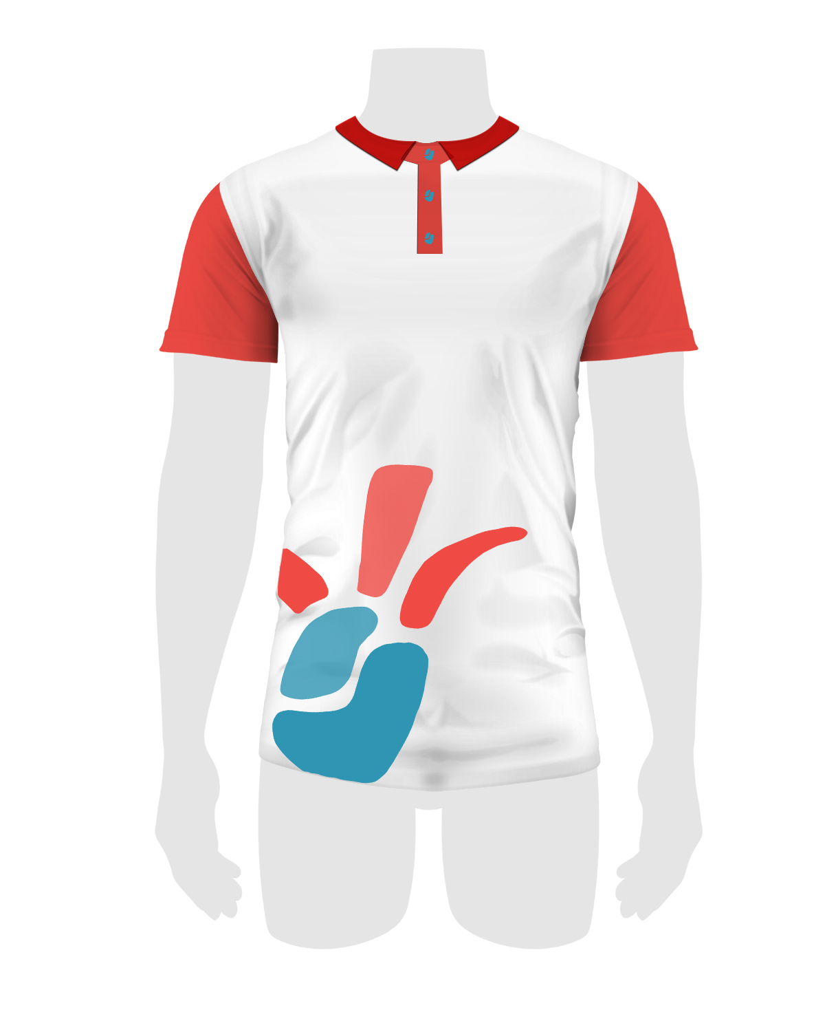
I think that any company should have personnel that can be distinguished from costumers. By having employees wearing this polos with the company's colors and logo, the oportunity to sale items would increase.
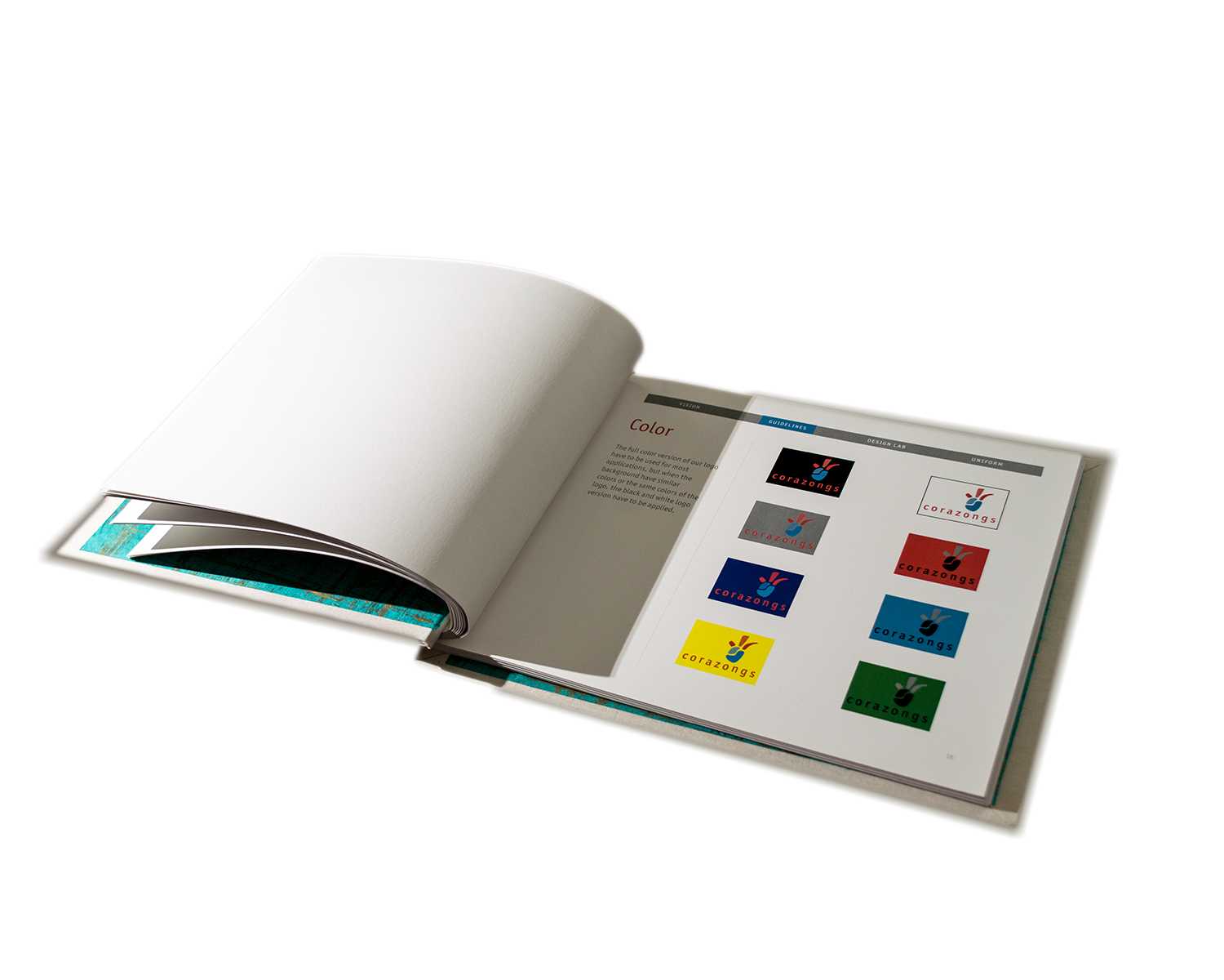
The brand guide was a really beautiful element to my brand system. My creative design kicked in during the process. I looked at many brand guide samples but the one that really caught my attention was the ESPN Brand Guide. In Addition, I hand bond it because I really love craftign with my hands and I beforehand had learned bookbinding in History of Graphic Design.
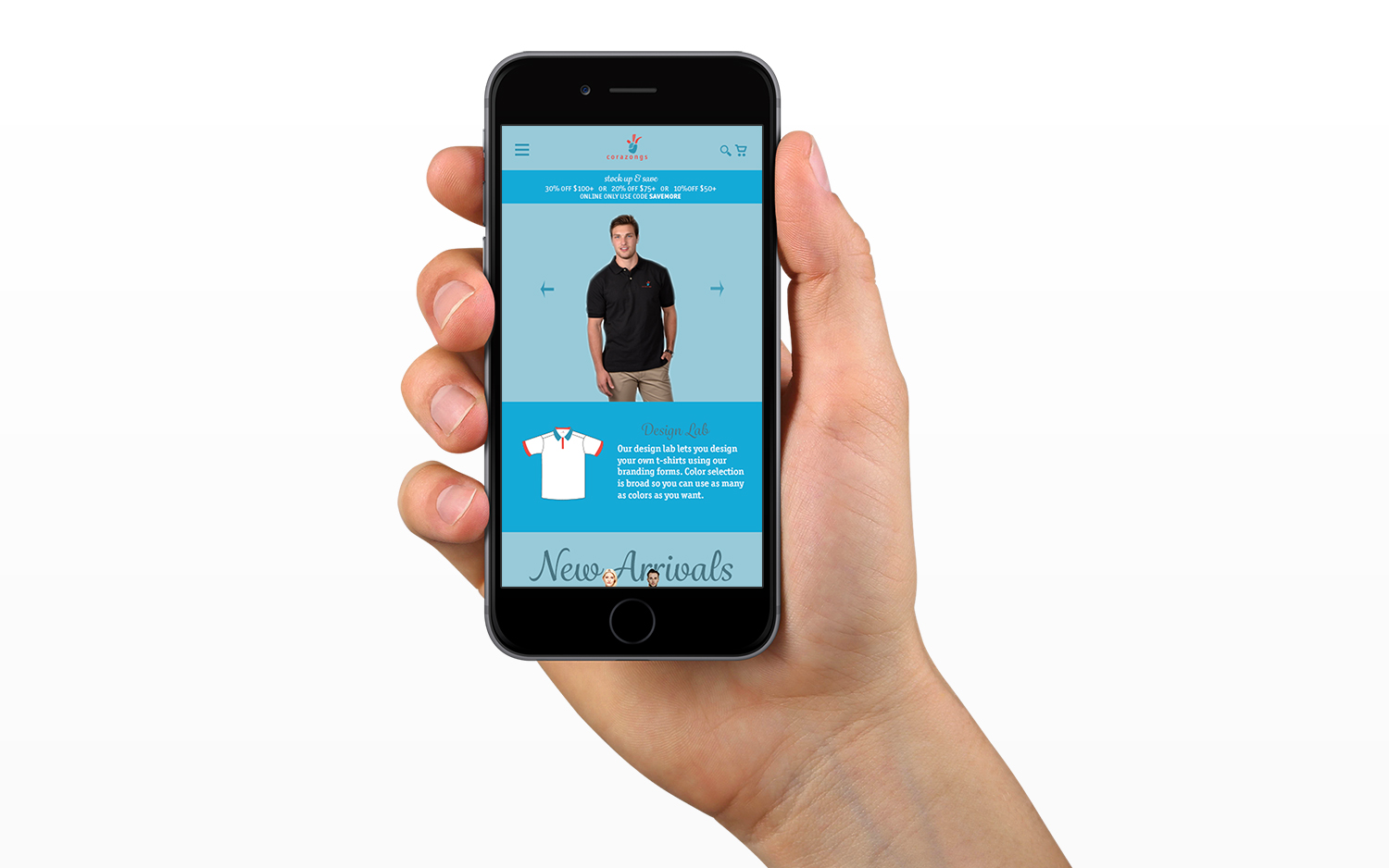
The website is responsive to any device. The concept was developed with a resolution of 375 x 667 pixels in mind. Every detail of the website was carefully inspected to make sure every element plays in harmony with the rest.