Logo - Zapopan United FC

As the creative designer of the team, I was in charge of the design and development of our identity. However, the whole team threw their ideas in which is something that I consider a priority.
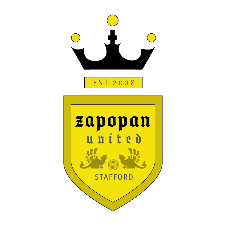
I already had the name and the colors. I did some research on soccer logos and some seals of Zapopan which is a city in Jalisco, Mexico, and the majority of the players come from there. After a long research and communication with the team, I created a logo that was submitted for revisions among us. We came to a consensus, and the final identity of the team is a seal with our two main colors, black and yellow. The seal encloses two creatures that look like dragons sandwiching a soccer ball. At the top of the seal, there is a crown with 3 circles which symbolize the three founders of the team. Underneath the crown, a bar with the year that we were established. The typeface has a bold feel and vintage look. With this logo, we intend to convey the good spirit of sportsmanship and comradeship.

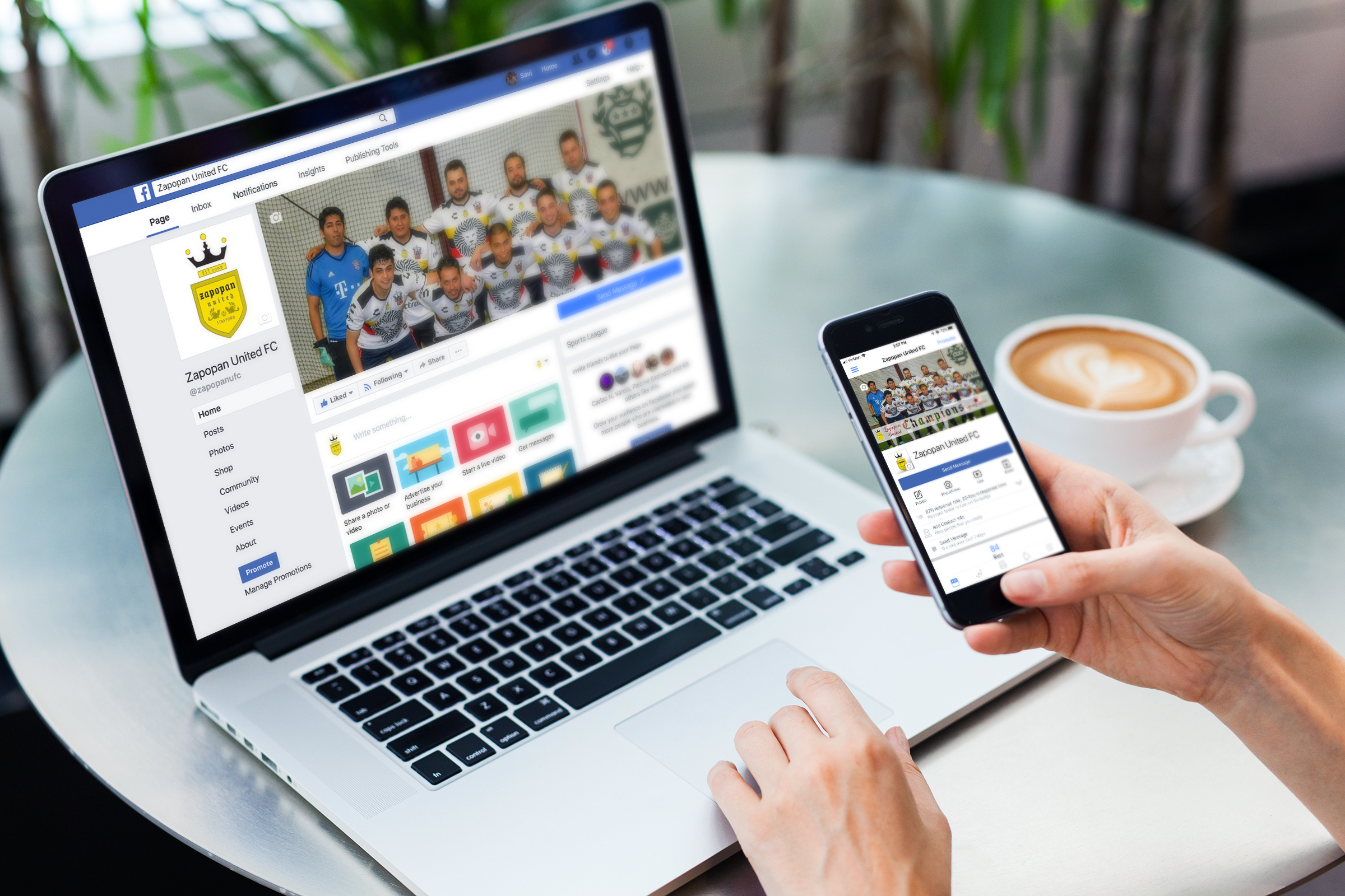
With Facebook gaining ground in the virtual life of people, we decided to open a facebook group page to post stuff about our soccer matches and funny material. So far the page has been fun to be managed. The integration of live video gave us the oportunity to brodcast some of the games to our followers in Mexico and The U.S.
