Chicago Fire Website
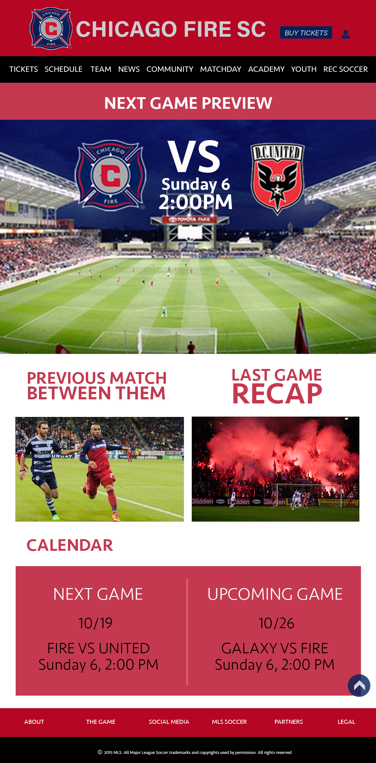
The project required every student to redesign an ugly or non-functional website. I chose the Chicago Fire Website because it contained unnecessary material and some information was repetitive. It also had a broad background versus a narrow body which made it more difficult to have a greater hiarchy. The redesign was a little hard for me because I needed to come up with a different concept than the MLS's.
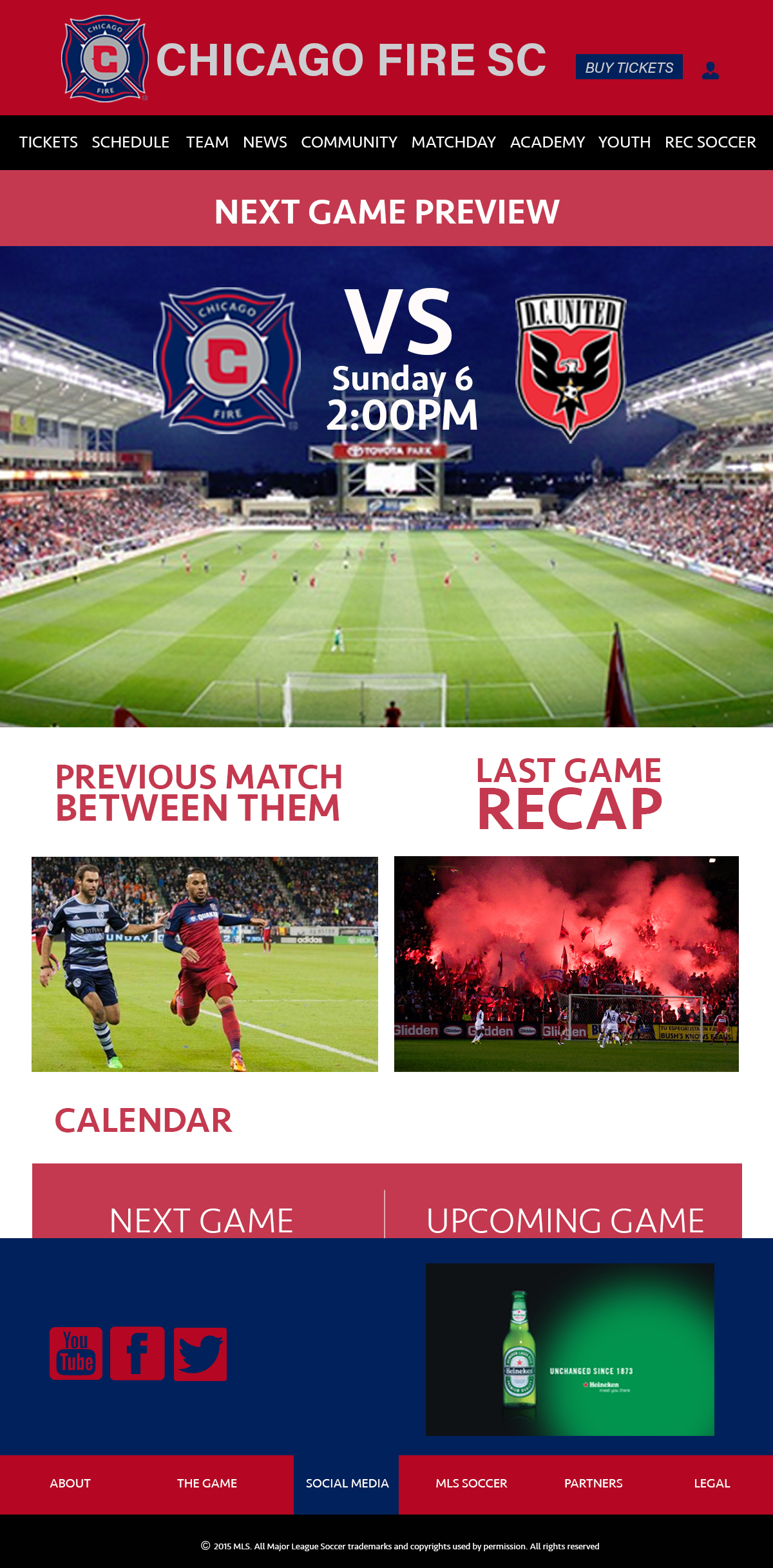
This picture and the one above is the home page.It is composed by the most important information: "Next Game Preview," "Previous Match Between Them," "Last Game Recap," and a calendar preview for the next two games. When you hover over any menu item you will have a drop-down submenu with space for ads. By doing this, I keep the ads in a sublime space.
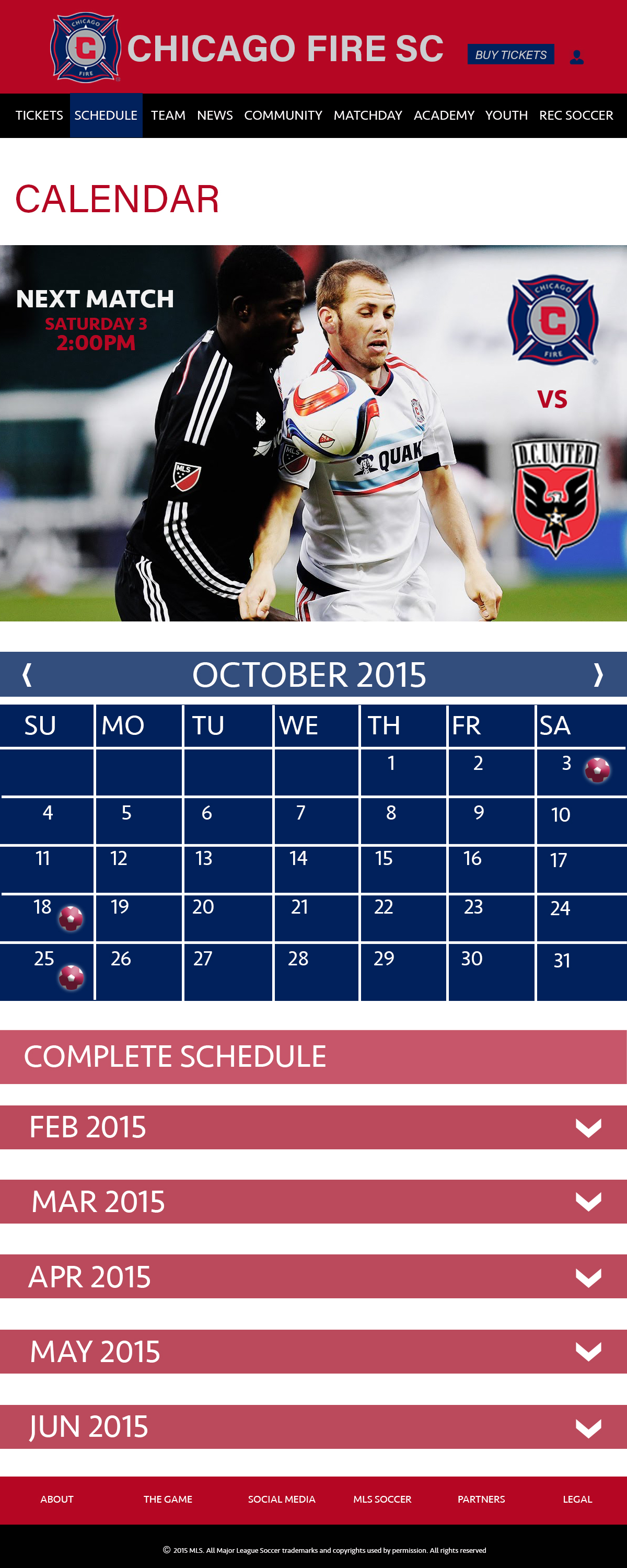
My calendar page consits of the calendar itself but it also includes tabs that let you see month by month and who they are playing against to.
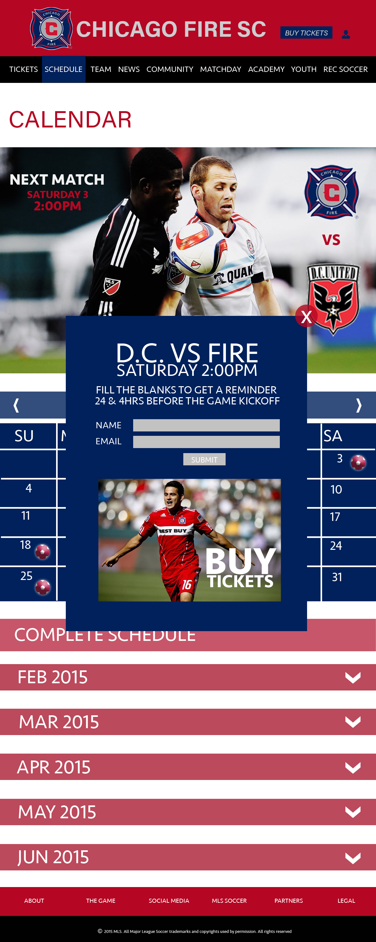
The soccer balls on the calendar determine that days that Fire has matches and when you click on them, a pop-up window shows up, so you have the option to fill the information needed or just exit it out by clicking the "x". The information needed is your name and email, so that Fire will send you reminders of the match.
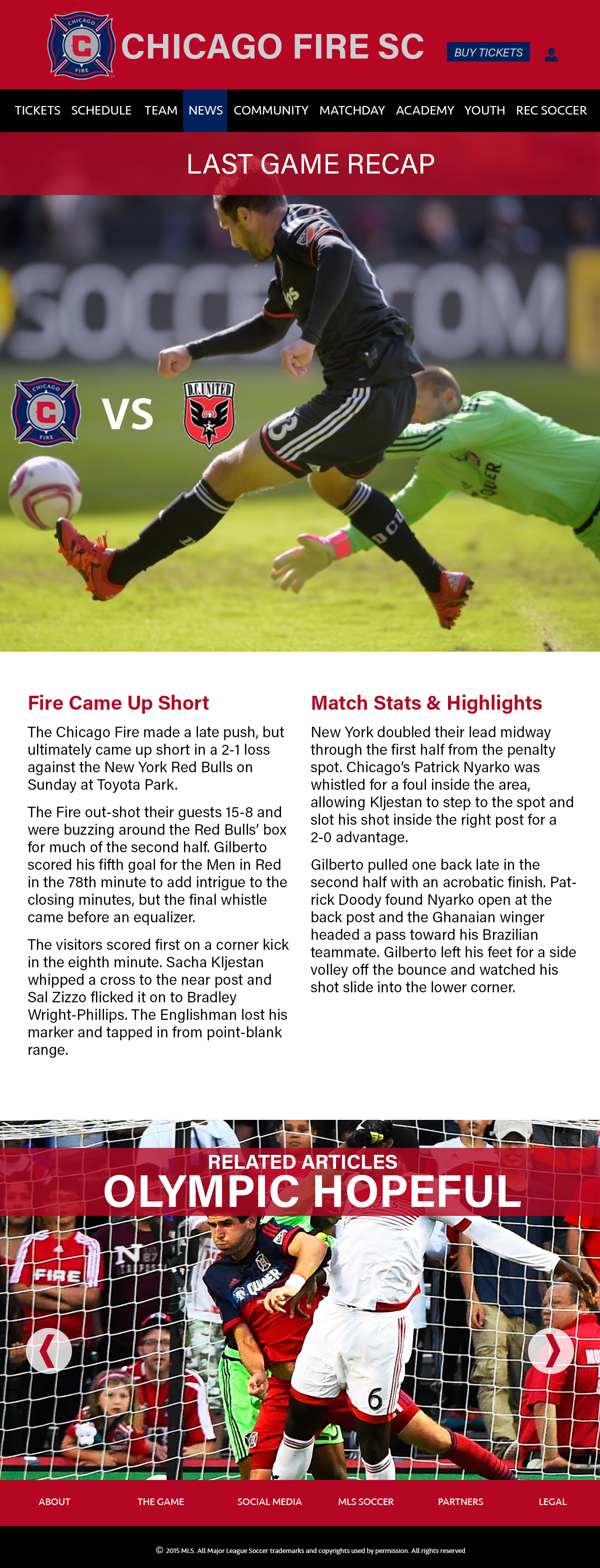
My news page is where you as a fan of Fire, will find valuable information about your team. You will be informed and know what is going on in the community of Fire. I wanted to keep it simple and take advantage on the negative space because when I think when people read a long article, no distraction should be there, and should be as legible as possible.

The standings page includes a feature that adds to the interactivity of the user interface. I think it is a feature that I would love as a designer and as a user. The feature allows you to unveil the teams positions in each conference. While you can see where your team is standing on the top right, you cannot see the others.

This is what you will see when you clicked on "unveil." By having the team logo and a red strip on the background, you are able to indentify Fire quickly and learn about its stats easily.