Magazine Redesign - Socccer America Magazine

The project required us to redesign an existing magazine. I chose SoccerAmerica Magazine.
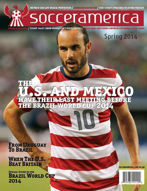
The development of the cover was a really hard job since I could not find good images. I personally think that if you cannot get it the way you want it, you have to do it yourself. That is why a designer needs to know at least the essentials of photography. In summary, after navagating the web, I found Donovan looking good. I clipped out his head so that I was able to place the redesigned logo behind it.

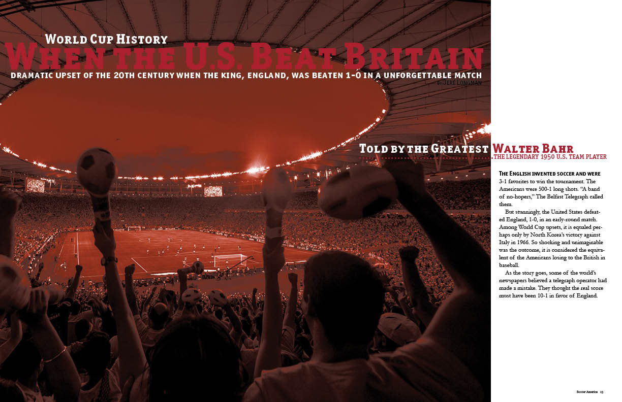
This is an example of an opening spread of a feature that I designed in the magazine. I challenged myself using scale to treat the headings and subheadings harmonically.